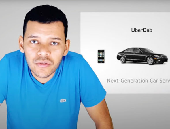
This is the pitch deck that Uber used to raise their first round of funding, back in 2008. It’s a fantastic example of a perfectly defined problem/solution combination: so obvious it’s surprising nobody else saw it before them.
Ideas are worthless without execution… but well, this was a multi-billion dollar idea.
Now the slides certainly look very 2008. Or very 1999. Anyway, we took the liberty of running them through our AI presentation design tool, so you don’t have to endure Arial.